Marvelous content developed with the world's leading artists and thinkers
Create Your Own Pride-Themed Scribit Drawing with FUORI!! Magazine
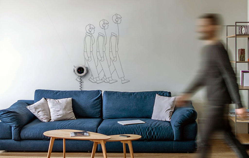
A graphic symbol of Fuori! Magazine, this ticking time bomb is the anchor of Scribit’s LGBT+ illustration collection.
Be Inspired by This Iconic LGBT+ Magazine to Create Your Own Pride-themed Scribit Drawing
With the Pride Month coming to a climax, we have curated a special LGBT+ illustration collection in the Scribit App. You can be a part of the creative process as well – go to our Create Page and develop your own Pride-themed drawings through our straightforward interface. To give you some inspiration, we spoke with the editor of the new book Fuori!, which documents how Italy’s first LGBT+ magazine initiated a wave of progressive changes in the country.
Rainbow flags are being waved everywhere this June as the world celebrates the pride month. However, such gestures of freedom were unthinkable only decades ago, with the LGBT community pressured by the society to remain silent.
 A sneak peek of Fuori!
Curator-journalist Carlo Antonelli looks back on an important inflection point of change through Fuori! – a recently published book that details the messages and significance of the eponymous magazine, released by Andrea Pezzana in the 1970s as Italy’s first LGBT publication (fuori literally means “out” in Italian). Published by Nero Editions, the volume’s ambitious scope is matched by its colossal size.
Antonelli sat down with Scribit to explain his research process and why the magazine is still deeply relevant to our lives 50 years after its birth.
How did you arrive at the idea of publishing a book about the Fuori! magazine?
My original idea was to talk about gender and queerness, and ideas that are out of the confines of social norms. One day, I came across this remarkable issue of Fuori!, which made me think this is a brand that would be perfect for a revival. I went to its archive in Turin and everyone was enthusiastic about the idea. Soon I met up with the pair of curators and activists who are known as Francesco Urbano Ragazzi. They are very eloquent in the debate related to gender and media studies, and came onboard to be co-editors of the book.
Our key message is to highlight the history of Fuori! to young people. Nowadays, the ideas of gayness and queerness have become more commonplace in Italy, at least in cities like Milan and Rome. But as a part of the leftist movement in the 70s, the magazine was trying to spark change in this regard. It proposed a radical idea because it didn’t just ask for the rights of individual to be acknowledged, it also fought for the rights of the collective, of the entire community.
 Snapshots of the book launch event in Milan.
When you were trying to distill many issues of Fuori! into one single volume, what was your editorial strategy?
It encompasses the first 13 issues of the magazine, when it was at its most radical in the struggle for civil rights like divorce and abortion in Italy. We put them all together with minimal interference. That means you get a thick amount of materials, 400 pages of them. Even if you don’t understand the language, you have a sense that you’re entering an enormous universe. I think that makes it interesting even to an international audience, who are our target from the get go.
The book’s cover features an exploding bomb, which is a rather striking symbol. What’s the thought process behind that?
The bomb was originally a small graphic sign in the magazine, but we enlarged it and put it on the cover. Our message is that it was considered “dangerous” content, from asking for radical change to the notion of being literally “out”.
 Carlo Antonelli (right) along with the other two editors of Fuori! Francesco Urbano Ragazzi.
How about the other types of content inside the book? Is there any that stands out to you?
There’s a lot of comical content between the important political discussions and the messages of the Gay Liberation Front [a set of transnational gay activist groups which first appeared in the US in the late 1960s, and reached Italy a few years later]. Lots of visual jokes, portrayed in the format of vignette drawings, are very funny. There is also a fantastic use of regional insult in funny ways. This mix of hilarity and seriousness makes the book more contemporary than historical.
On the other hand, the concept of sex and sexuality was depicted explicitly only in the articles but not in the drawings. Why did the magazine select this approach?
It would have been a big mistake had Fuori! gone in that direction, because it was exactly what the prejudice was about. The magazine was intended to reach everybody, so the editors didn’t want it to be censored or taken off the newsstands because it contained explicit materials. So it was a very deliberate decision. In comparison, publications like Tom of Finland had been circulated in a very small circle, hidden from public view, before it became popular later on.
Any final thoughts about the book we should know?
The book is not so much a coffee table book but rather the table itself. It is big, thick and impossible to hide – we don’t want people to put it on a bookshelf. I like to call it a “coffee bomb” in your house.
 The comical illustrations of Fuori!
 Discover the whole Pride Month collection via the Scribit app.
read more
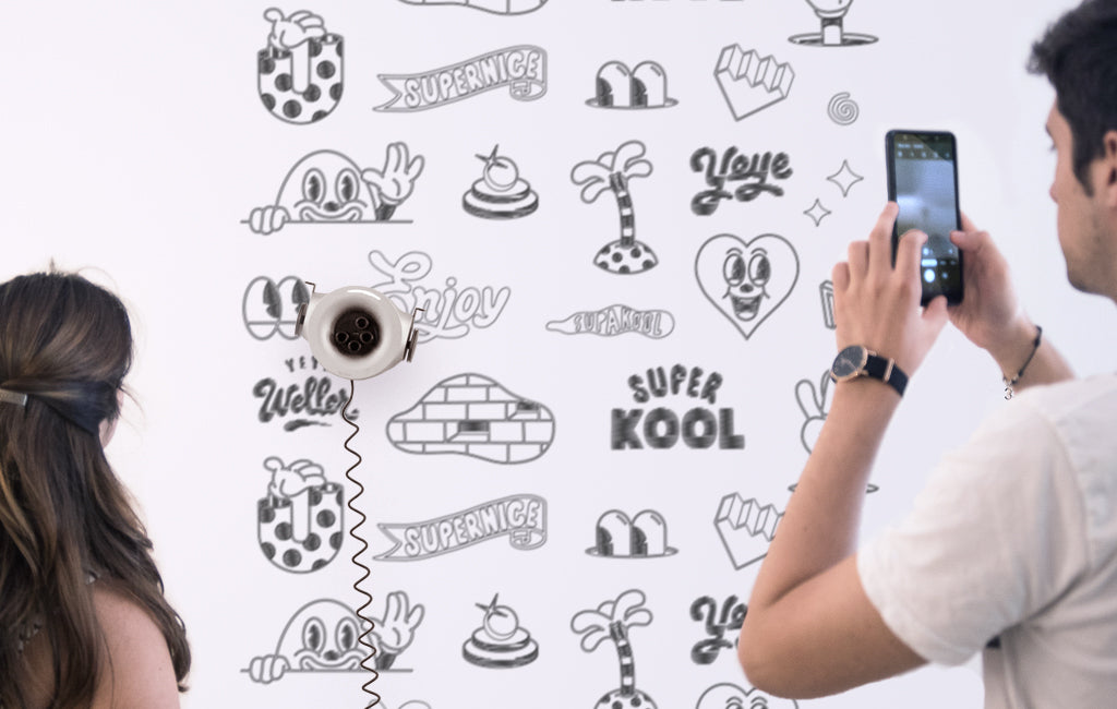
Coloring Your Life with Scribit and Yeye Weller
Start the new year on the bright side with a colorful drawing!
Talented German illustrator Yeye Weller conjures up a cheery artwork for Scribit, which turns the wall into a giant coloring book. While the draw-and-erase robot outlines the imagery in black and white, people are invited to participate in the artistic process and fill the blank space with their preferred shades.

As we continue to spend more time at home, Yeye’s retro poster-like creation not only brings an air of optimism to the domestic space, it also inspires us to imagine new ways to live happily.

Where do you take your inspiration from?
''I don't like those phrases like - inspired by nature - or something like that. To be honest, the only thing that inspires my work is the internet along with other artists. So keep your eyes open and stay different.
How do you keep the positive vibe across your designs during these uncertain times?
''I think it's my attitude to life. It was always a part of me. It sounds a little bit simple-minded, but that's what is all about: stay kind and be happy!''
How do you see a Drawing Robot like Scribit collaborating with your work as an artist?
''In general I like it. I'm always open for new things, and Scribit is really amazing. But in spite of that, we should never forget where we came from - it's important to love the new, but keep the old things at the same time.'' says Yeye.

You can now print Yeye's designs with Scribit. Discover the whole collection via the Scribit app!
read more
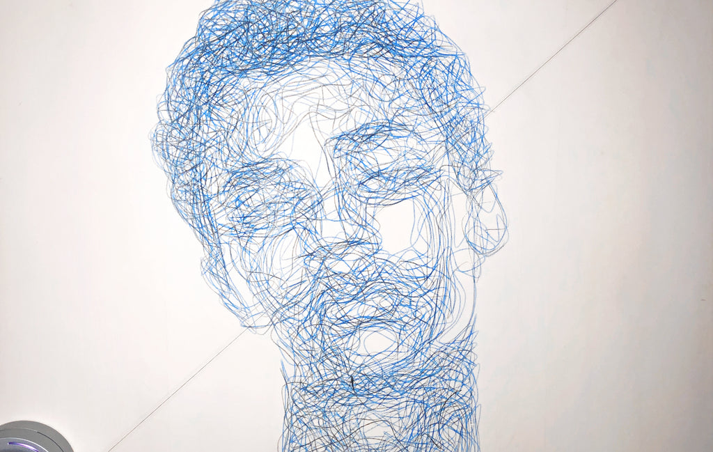
Algorithmically Generated Portraits with Spongenuity
Spongenuity
read more
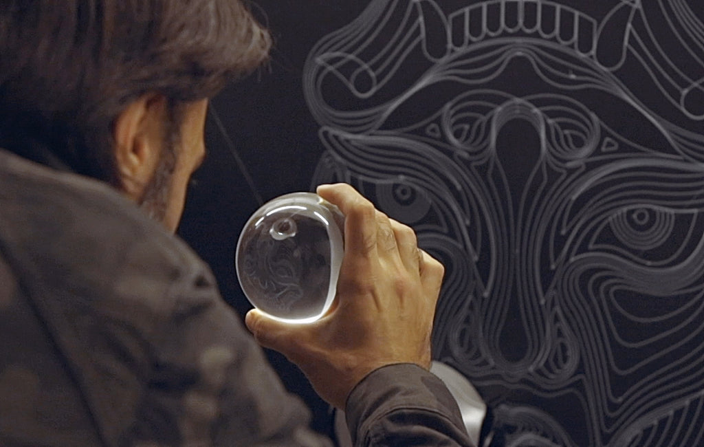
The double nature of Scribit’s drawings with Truly Design
A collaboration where 2D and optical illusion were the protagonists. Discover how Scribit executes Truly Design’s creative vision. These designs unveil a double nature: looking through a crystal ball or a steel cylinder, the Scribit murals turn into a completely new one!
Truly Design is an unconventional studio founded in 2007 and directed by urban artists active in the graffiti scene since 1996. Their signature style? 3D graffiti & anamorphic art, this time performed by Scribit, the Drawing Robot.

''Initially, we thought of Scribit as a competitor for artists, but after understanding Scribit's mission and playing with it, we decided to collaborate: Scribit doesn't want to replace artist - it's just a tool for them! A technological tool that allows sharing your art with a reach that would otherwise be impossible for us. The artist keep the freedom of expression, always!'' - says Emanuele "Rems 182" Ronco, Creative Director @trulydesign
Find their designs ready to print via the Scribit app!
read more
Feel good murals to brighten up your mood with Hikimi
Hikimi
read more
Search
Everything you can find in our store.